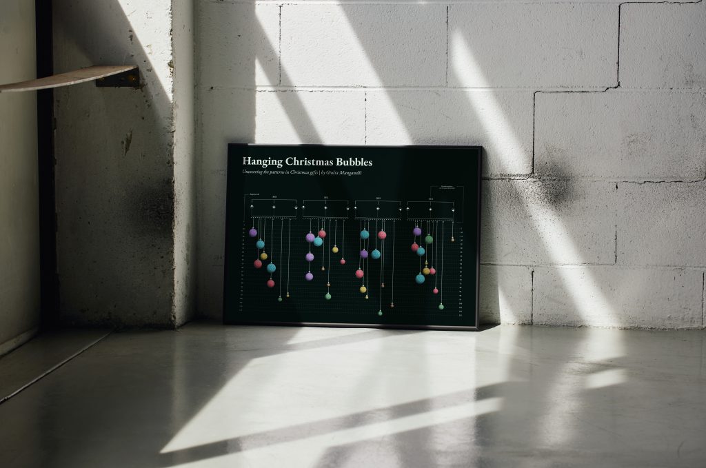
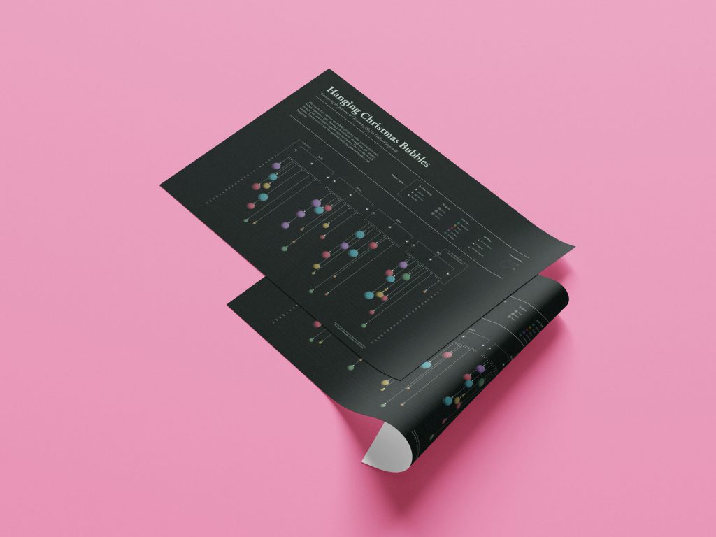
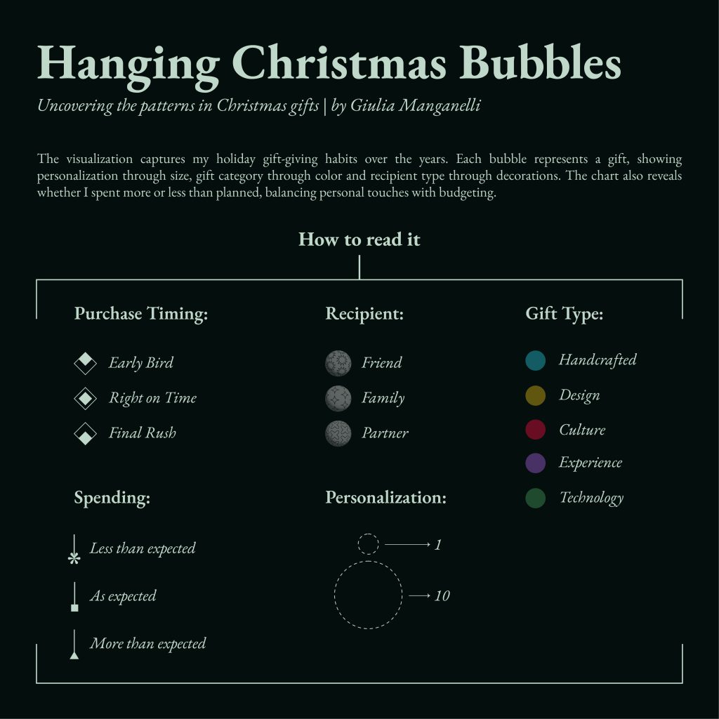
Hanging Christmas Bubbles
Data VisualizationThe visualization was created as part of the Journal Dataviz Challenge, a highly engaging initiative that challenges participants each month to develop a data visualization based on a specific theme.
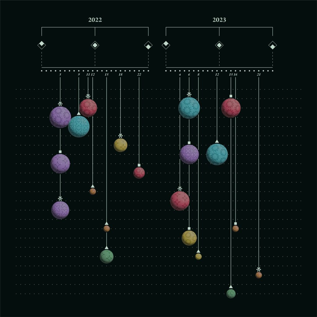
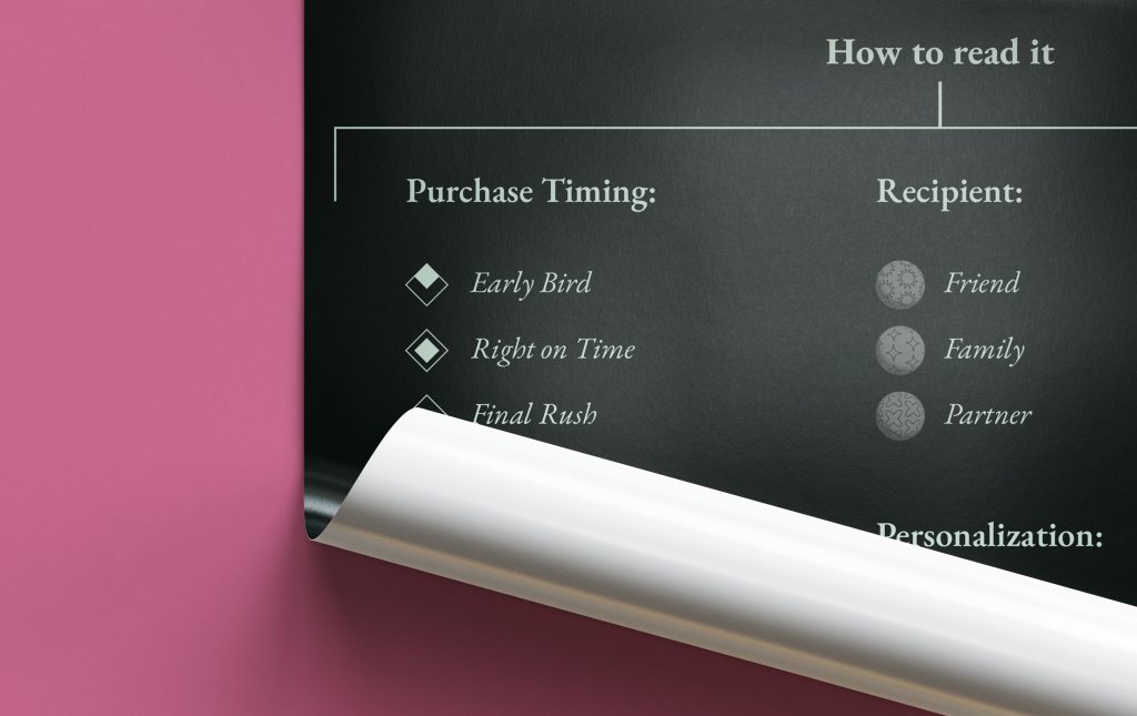
For December, the theme was centered around shopping habits, with a focus on how to manage Christmas gift purchases while maintaining a balance between thoughtful gifts and mindful spending. What I love about this challenge is the creative freedom it offers to participants in terms of design. This encouraged me to experiment and step out of my comfort zone. I used data collected through an expense tracking app, which allowed me to conduct a temporal analysis of purchases made during December from 2021 to 2024. The purchases are further categorized based on timing: those made well in advance (Early Birds), those purchased just at the right moment (Right on Time), and those made in the final rush (Final Rush).
The visualization itself is a bubble chart, where the bubbles are plotted based on the amount spent (Y-axis). The “hook” on each bubble indicates whether the actual spend was less than, equal to, or greater than the budgeted amount. The size of each bubble represents the level of customization of the gift, and different decorations on the bubbles indicate the recipient (family, partner, friend). I chose to represent the data using Christmas ornaments (bubbles) because of their simple, customizable shape, which works well for representing different levels of analysis.
This project won the December 2024 challenge, and I am extremely grateful to Cédric Scherer, an incredible DataViz specialist whose work I deeply admire, for his kind words in selecting my project:
“After much deliberation, my pick for the challenge is the stunning visualization of Christmas gift habits, represented as festive Christmas bubbles, created by Giulia Manganelli. What stood out to me was the perfect blend of creativity, clarity, and detail. The chart beautifully captures the festive spirit while encoding multiple variables in an intuitive way. It’s remarkable how Giulia visualized seven different metrics for multiple years while striking a balance between artistic flair, clean design, and interpretability. The clever use of bubbles with varying positions, sizes, patterns, colors, and symbols encourages exploration of the patterns over time. It’s a truly aesthetically pleasing chart that is a joy to look at and interact with!”