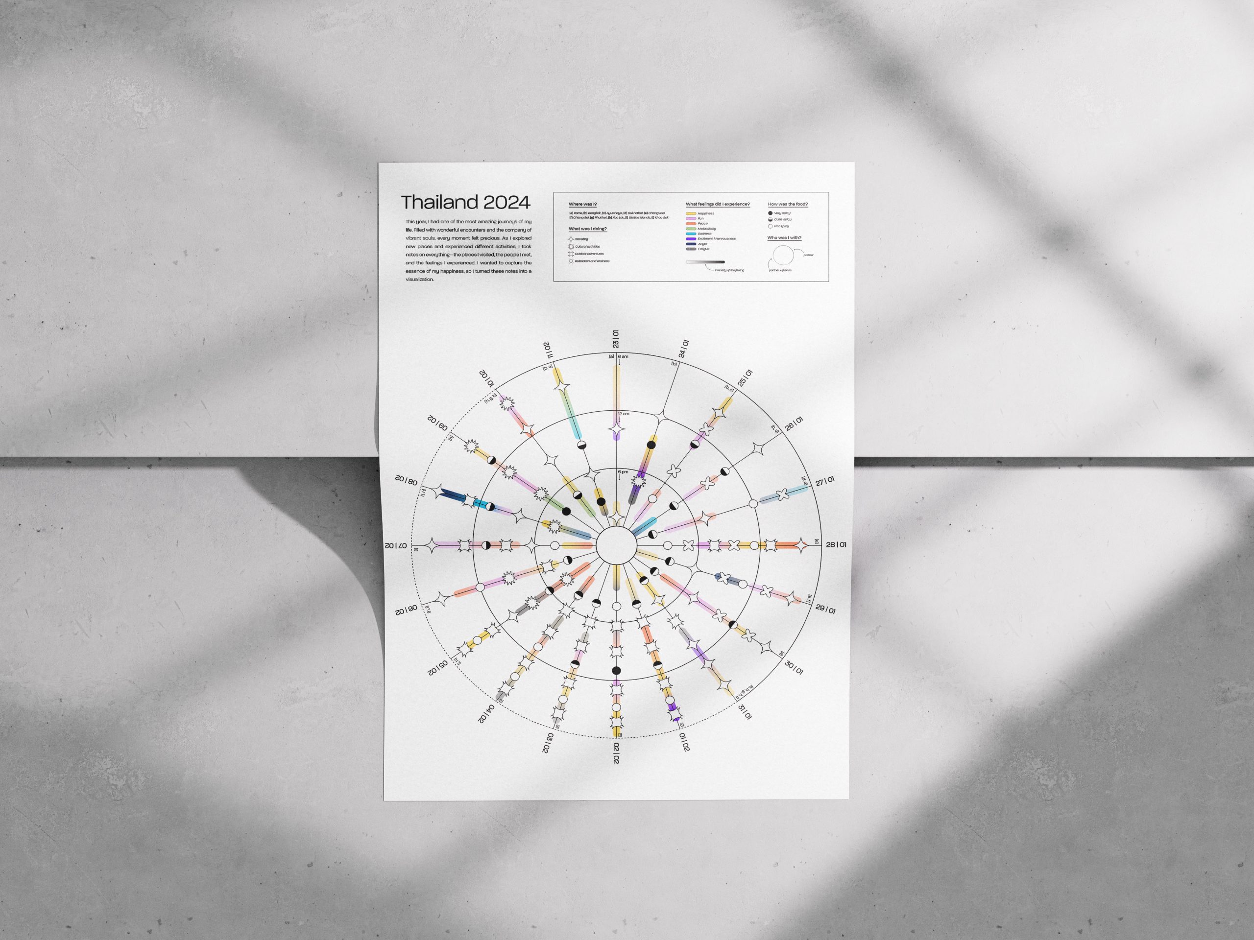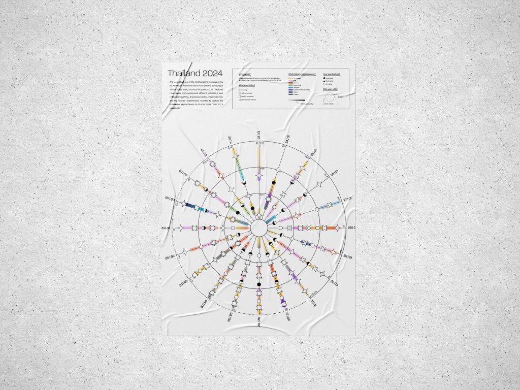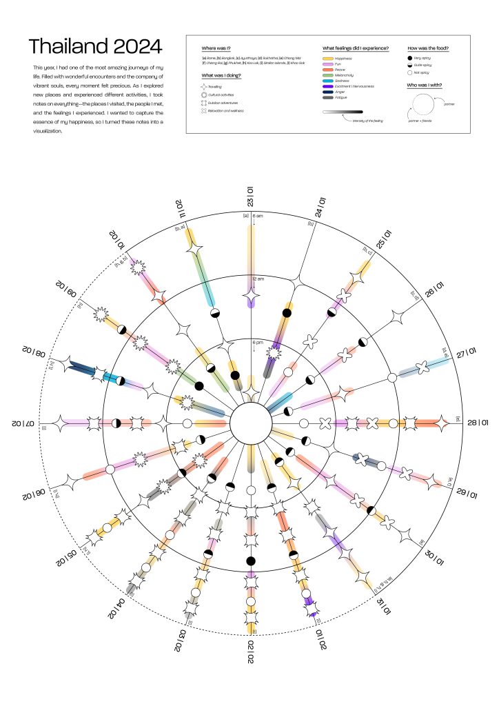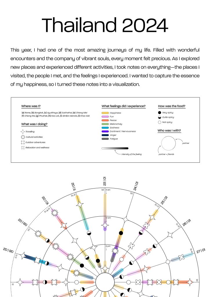
Thailand_2024
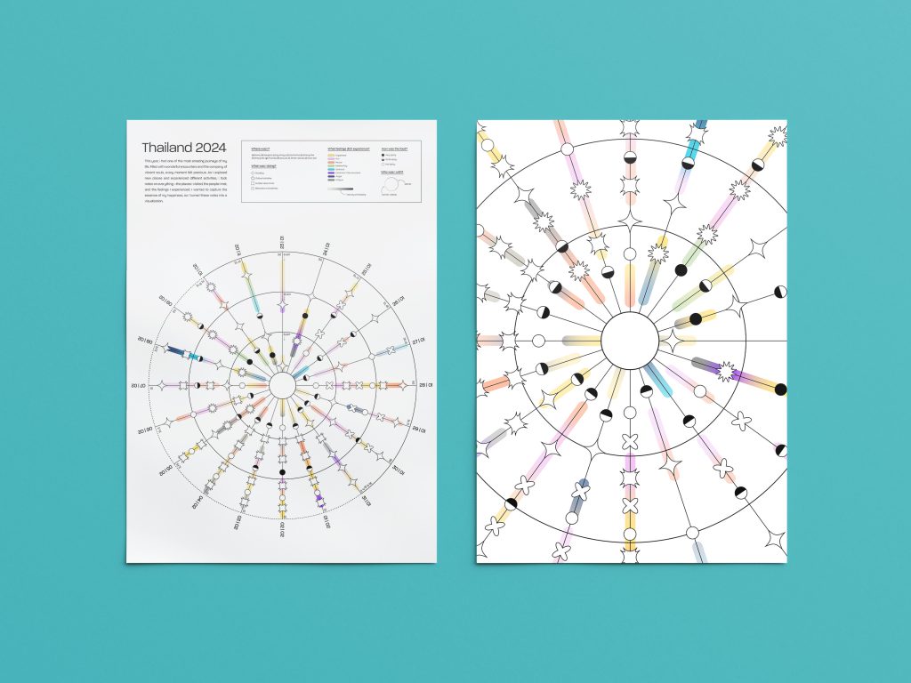
Data VisualizationIn February 2024, I embarked on one of the most exhilarating journeys of my life: for nearly a month, I traveled across Thailand from north to south with my partner and a group of friends who joined and left at various points along the way. Each day, at different times, I documented a dataset capturing the activities I engaged in, the emotions I experienced, and the people I was with. More than just a dataset, it turned into a true diary in the form of a table, which I then used to create this radial chart.
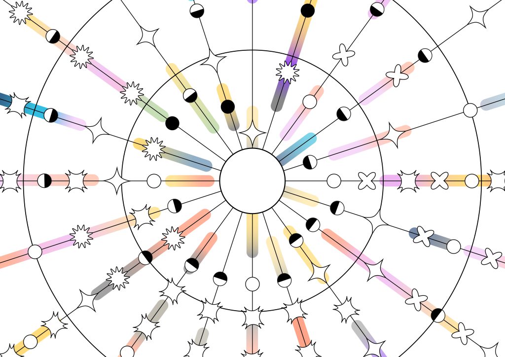
Each line in the radial chart represents a day, divided into three time slots (6 am – 12 pm / 12 pm – 6 pm / 6 pm – 12 am). A legend allows you to see where in Thailand I was, while icons indicate the types of activities I was doing. The continuity or breaks in the line show whether I was traveling with just my partner or also with my friends. The most intriguing part of the chart is the section that tracks my emotions, which I wanted to be specific and nuanced, rather than overly simplified. These feelings were often subtle and blended together, so I chose to represent them using gradients for a more accurate depiction.
Finally, I included another set of icons to show the spiciness level of the foods I ate. If I weren’t such a fan of chili, I’d probably say I’ve had enough to last me a few years!